Is there a possibility to get rid of the sidebar that is there since yesterday?
It‘s annoying the hell outta me. It‘s taking up space so I need to turn the tablet to see the new topics which I didn’t have to do before and it‘s the only forum I have to do it for. It‘s colorful and no matter how often I kick out all categories in the settings, as soon as the site gets reloaded they are back. It‘s moving in different ways than the forum itself when scrolling. I‘m autistic and change is hard anyway but I tried to get used to it with adjusting as much as I can but really it‘s overwhelming for me.
Is there a possibility to disable the sidebar in the settings so that at least those who don‘t want/need it or feel overwhelmed by it, can opt out? Please.
Click the sandwich menu next to the logo.
Uh great. I‘ve tried so many things but didn‘t come up with this. This at least seems to help with reloading the site. Not with the space and turning the tablet to see the topics but at least part of it is better this way.
Thank you.
I don’t have a tablet so I can’t test. What is the difference in behavior before and after the update? Also just for clarification, this is a new feature from a forum software update and isn’t something that the staff explicitly added.
It looked like this
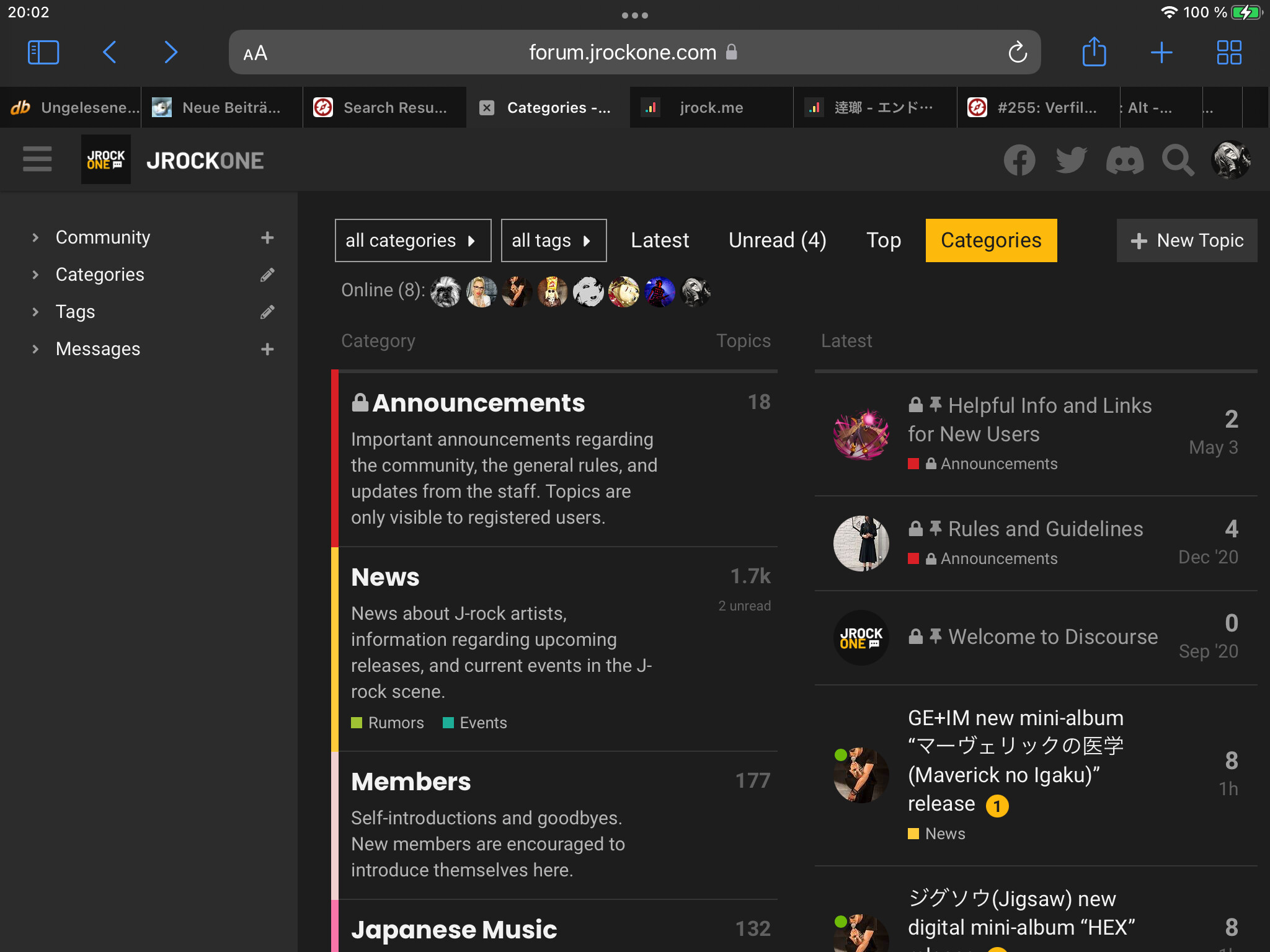
Without the sidebar but in the other format.
Now it looks like this and I have to turn the tablet to see the topics:
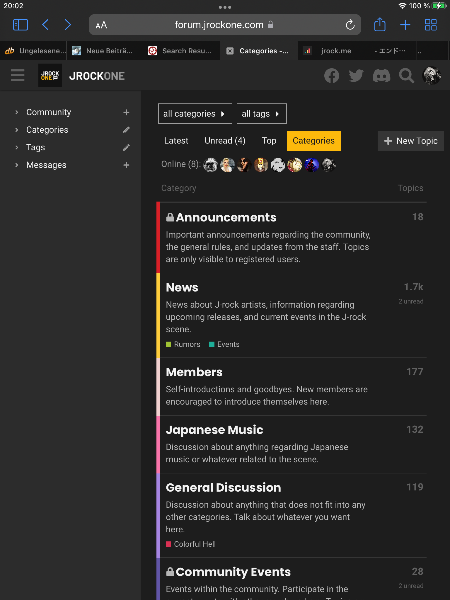
And I feared it was an overall update.
Replying with the turned format is annoying, too because
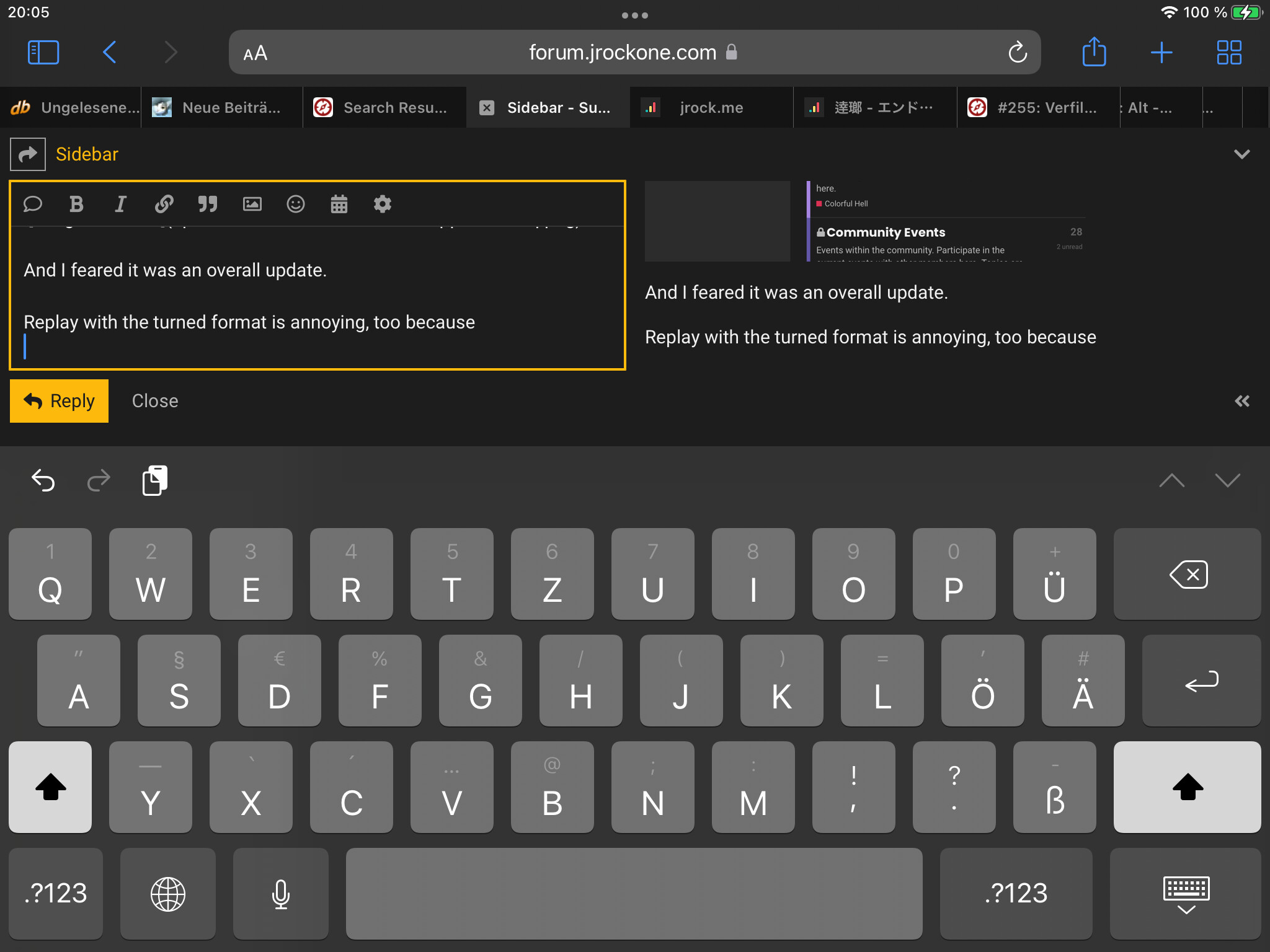
You see that leaves really little space to see the reply and preview while typing (don‘t mind the typo in the pic, the huge keyboard and everything else confuses me a lot).
Hmm @nick and I will look into this and see what we can come up with.
That’s how it should function on a tablet vertically. The sidebar itself can be toggled on and off. When it’s on, the right side will be collapsed into 1 column and the topics can be found under the categories. This is called responsive web design.
The on-screen keyboard taking up 60% of the space on a horizontal screen in the last screenshot is normal too. This isn’t JRO specific, it happens on every website when a textbox is focused when using a tablet horizontally.
It‘s just, I don‘t need to turn the tablet horizontally for any other forum because there‘s no - for me - useless sidebar.
I do know what responsive designs are but in my opinion this one ain‘t very helpful for tablet usage.
You don’t have to turn the tablet horizontally to use JRO. Just toggle the sidebar off and you can use it vertically. Toggle it on occasionally when you have to use the menu on the sidebar.
Well, after I found how to toggle the sidebar off, it looks like this.
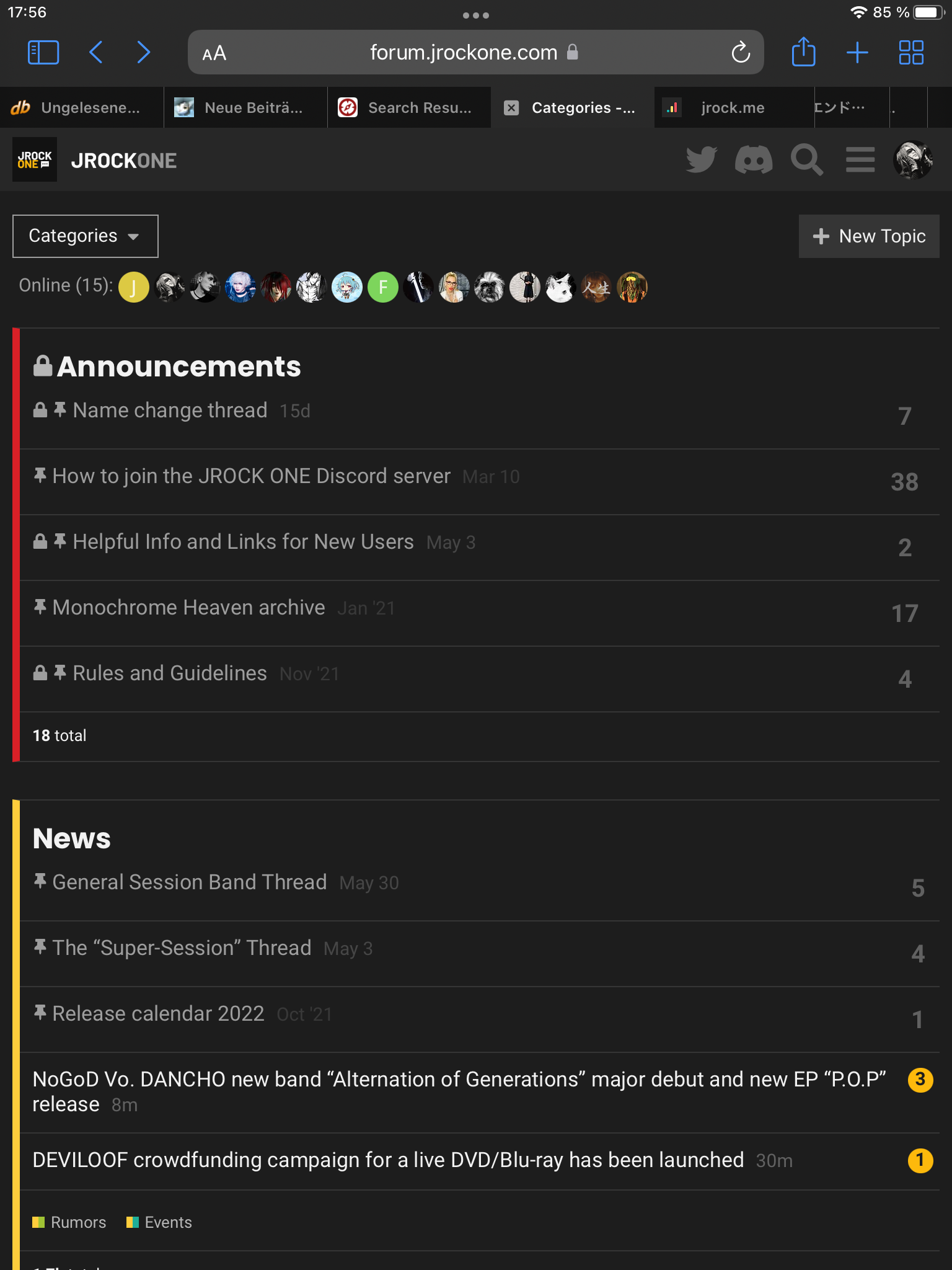
That‘s still not how it looked before for me.
All I wanted was the categories and the topics with the last updated one on top like it had been before. And how it still looks with the sidebar on.
LoL after sending the reply it‘s the sidebar plus both columns, categories and topics. I wonder how long this will last because right now it feels like it‘s looking differently all the time.
You’re using the mobile view. Can you toggle the desktop view by tapping the monitor icon at the bottommost of the sidebar?
The sidebar is the future, the Discourse team also has it enabled on their official forum.
The edit to my post was when I was back to desktop view. Which I had been going by before, too, when there was just the categories column. I really hope it‘ll remain how it‘s now. I can ignore the sidebar since I could manage to sandwich the menu in it. As long as there are both categories and topics I‘m fine for now (I just don‘t trust it‘ll remain like this until I see it).
// ==UserScript==
// @name        Remove Discourse Sidebar for JRO
// @namespace   Violentmonkey Scripts
// @match        https://forum.jrockone.com/*
// @grant       none
// @version     1.0
// @author      colorfuljinsei
// @description "Nuke that sidebar!"
// @require https://code.jquery.com/jquery-3.6.1.min.js
// ==/UserScript==

window.onload = (event) => {
  $("body").removeClass("has-sidebar-page")
};
For those like myself who abhor the sidebar, lol. Just add the stuff above to a new script.
*FIX: Changed $( document ).ready() to window.onload, and while it’s not as fast and looks a bit jank, it’s more consistent when logging in/out. Should only fire when when loading or refreshing the homepage since it’s a single-page application.
That’s not a recommended solution. You can simply toggle the sidebar off if you prefer the old look. Why make it so complicated?
It reactivates with a new browser session, and it saves me a click, lol. Until there’s the option to have it hidden by default, I’ll just make do with the script.
Aside from this, as expected it‘s back to either the mobile look that I could never stand or the sidebar plus categories or turning the tablet to also get the topics. Not surprised, not content though (not criticizing you, @nick ).
That‘s not true. I did have a desktop view with two colums without turning the tablet and except for that one time earlier it‘s always either this or that but not that. Toggling it off always means a mobile version, not the desktop one.
Personally, I don’t have any issue with the sidebar whether it be on the mobile or desktop view, and see these sidebar complaints as the users’ different preferences even though it can be easily toggled on and off for those who prefer the old look. And if you’re logged in on the same browser, the sidebar’s state is saved.
The sidebar is still in the experimental stage and the Discourse team will implement more features on it from what I have seen. Even so, I haven’t found any issue with it enabled. I always keep the forum software up to date. Let’s see if there is any change in future updates.
Toggling the sidebar and switching views between mobile and desktop are two different things that work separately. The burger menu is on the right before your profile picture on mobile mode whereas it’s on the far left on desktop mode. With the limited width on a tablet and a mobile, you’re encouraged to use mobile mode.
But according to Kuro’s 2nd screenshot (vertical desktop mode), their tablet seems to support both modes, and the 2nd screenshot is how it should look in desktop mode on a tablet. Just toggle the sidebar off, you should see both the categories and the topics.
I don‘t know how to not see the sidebar without switching to mobile. And that‘s why I don‘t get to how things looked before.